You may have noticed that the website’s had a bit of a re-design.
I set out to make a few tweaks to help me with some design decisions, but ended up continuing and doing the full job.
I suppose it felt right to put things in to action whilst they were fresh in mind.
The end goal with the change is to evolve the Premium Site.
That site hasn’t been altered yet (that’ll be phase two), but many of the decisions here were made to be carried forward.
Fluent navigation, access to videos, plans and discussions will all be improved.
Everything works fine now, but these updates will give us a solid and more organised platform for adding content to.
It’s all so we can put our focus on the content creation, knowing that everything is easy for you to use.
Spotted An Issue?
Change isn’t always favourable, and I’m sure there’s going to be at least a couple of teething problems that I’ve yet to spot.
Please feel free to let me know if you find anything that’s broken, odd, or confusing.
I’ll do my best to put it right.
What’s On The Way?
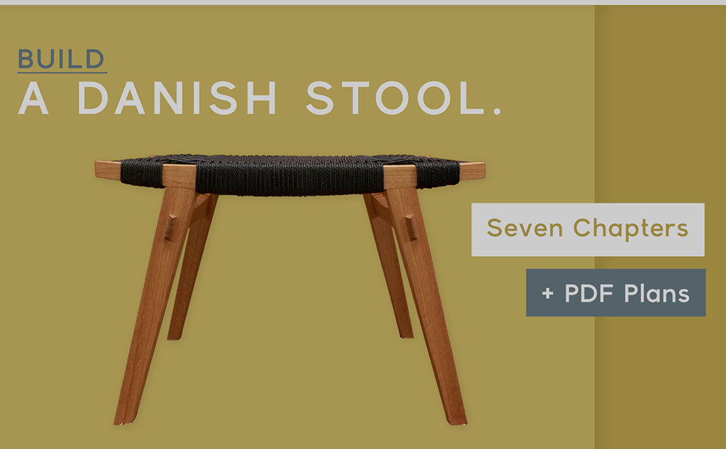
A New Build –
So this quiet spell on the blog has been down to me.
It made more sense to complete the updates before adding new posts.
Fortunately we’ve also been very busy with filming and our next Video Series will be ready to launch early next month.
We’ll be telling you more about that one shortly.
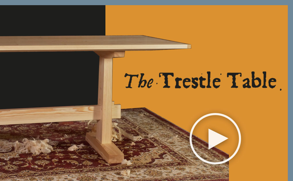
Completing The Table –
If you weren’t watching along then you might not be aware that our Hall Table Build is well and truly complete.
It’s our longest series to date and we’ve been thrilled by the response we’ve had.
It’s wonderful to hear how much has been learnt from this build.
If you’ve been waiting for it to complete then you can now find all of the details here.
Paint Making –
Yep, this one is going to go ahead.
It’s been something that I’ve been intending to do for a while.
While it won’t be our next launch, but I’ll be putting my attention on it soon and it’ll be on it’s way later in the year.
I’ll keep you updated.
Thanks for your patience with the site update.
Do let me know if you spot an issue.

It’s looking great Helen. Straightforward, highly functional, easy to understand, all the things a good web site ought to be. The only thing to complain of is a little bit at the very end which has a title of “About Helen,” but no other information and no link.
We know you do really fine work, but maybe a little more about you?
Thanks Bob,
I’m pleased you’ve found it easy to get around.
Yes, those ‘about’ sections do need filling in don’t they. I’ll get that sorted.
Cheers.
Links for sharpening and hall table videos are interchanged on “The Videos” page.
Well spotted!
Thank you, I’ve switched them round.
Hooray! Redesign looks great. Looking forward to it all.
Hei Helen,
I… am torn in two with the redesigns of most websites these days. Often the focus lies too much on smart phones and tablets. This one is actually still usable quite well on a regular computer, so: good work!
One thing: when it comes to the menue on top, I would like the link Videos to lead to the video entries of the blog rather than the premium videos. To me this would make a bit more sense (from what I am used to). However I can get why it is set up this way.
Anyway: thanks for the time you spend on this whole thing, I have to say rewatching the earlier videos after the hall table build did show me how both of you greatly improved over the last years in producing these videos!
Thanks Joe,
Setting things up to work on all screen sizes is definitely the biggest headache.
I’ve been browsing on my phone a bit more today and feel there’s still a few improvements to make there.
We’ll have a think on the video link, we could certainly add one heading to the blog entries if people would like to see that.
Cheers!
Thanks for taking your time to read and reply! And I did not look at the menue entries, I have to admit. Very prominently the first entry under “blog” says “video posts”… (thanks for not pointing that out in your reply…)
What I am missing a bit is that some parts of the website had a bit of the same vibe as the sketches in the video – that was really cool, it made the website special. On the other hand: special (almost) always means nasty legacy hacks that are impossible to maintain in the long run, so I do get that reasoning.
I am looking forward to the next project, but am happy to have a bit of time to straighten up my own back yard! My english bench is almost finished, and i have a number of chisels and planes to sharpen, not to mention one plane to build…
The site looks great. Keep up the good work, it is highly appreciated.
Thanks David,
Richard’s just been sending me some photos of your bench build… excellent job!
Thanks for sending them through.
I think I’ll be attempting one of those outdoors tidy ups shortly, though maybe not today… we’re promised rain.
Helen, While I just meant a general tidy up of the shop, and all the little things to do before a new project, I couldn’t do the whole real back yard thing this weekend, a foot plus of snow for us. Looking forward to the rain, right now!
Cheers!
Helen,
I am not at all fond of the new site as I felt the old layout and design connected with the topics offered. The new design seems to be too plastic and cold while, at the same time, seems to detour from the philosophical connection with hand tools.
As you can see I am not for change but fully understand what you did because having designed hundreds of web sites we, my wife and I, have done exactly the same thing. I guess you could say that a few tweaks that turns into a full design change could be compared to using a cordless electric drill then going to a full electric shop. Oh well.
As I mentioned in your FB page content rules but it will be a while before I get the loving feeling with the new site I had with the old site. And your content is the best!
Thanks David,
I really appreciate your honest input.
After working on the site for a while it’s easy to loose site of the overall feel so perhaps I’ll try and look with fresh eyes in a couple of weeks.
Maybe the black headers are giving you the cold feeling?…
A full redesign was the intention, I just hadn’t planned to complete it at this time.
The previous site had had many tweaks over time and I needed a clean slate to keep up with technical updates, along with our planned changes for the Premium site.
Overall I’ve tried to keep the minimal approach that we had on the previous design, so the content is clear and easy to use.
At the moment I’m not sure that I find this design any more or less plastic than the previous, but I will keep this in mind over the next few days and see if I can settle on why it may not be having the right feeling for you.
Thanks again!
Hi, I really like the new design, quite a bit clearer than the old one. The content has always been great, but the new design makes it much easier to navigate trough it.
One little thing however I find a bit distracting, the buttons for all the social media (fb, twitter….) on my computer they are extremely close to the text which I find a bit distracting (I think it would already help a lot if they were moved a bit to the left or just move them to the top of the page (next to “BLOG THE VIDEOS” and so on), and on my phone I don’t like how they cover half of the screen at the bottom, feels like something is always in the way, maybe move them to the menu?
anyway, just my experience. and thank you for both very much for all great free (and also paid) content.
Helen,
I must agree with Mr. Clark, in essence, although I’m not sure “plastic” is the proper word. I was very comfortable with the appearance of the last version of the site. It just felt familiar and comfortable, and was a vast improvement over the original.
It appears to me that the home page now has more of a marketing flavor, with all the wares prominently displayed. I can’t argue with that approach, especially for newcomers curious about what is offered. But the last version seemed to me more of a testament to Richard’s
skill and teaching, and an emphasis on the blog, which I’ve found to be priceless.
Rather than being critical, I simply hope that your design grows on us. I know you’ve put a great deal of effort into this, and it may well prove to be easier to navigate for newer members. And if it helps promote the business, then all the better for us who have been following your exploits for several years now.
I greatly appreciate all that you and Richard have invested in us, and hope it continues for many years to come. Thank you so very much for all your contributions.
Helen,
Just a short note to apologize for using the word plastic in my previous comment. I am sure it rubbed you the wrong way but that was certainly not my intention. I thought your original web page was really good, a cut above all the rest to be sure and fun to visit. And, as we all know, it packed lots of really good stuff. All that good stuff is in the new page as well so nothing is lost.
I know I will come to like your new page as much as I visit it more and more and as you tweak it to your own high standards. Even though there are lots and lots of companies who want to sell web page software so everyone can make their own home page, really good web sites are not easy to design, develop, deploy and maintain. And, it takes tons of time to get it the way you want. You’ll get it at some point and folks like me will forget the old page as well.
Again I apologize for not being clear in my rather unfair critique.
Really no need to apologise, I’m grateful for your opinion, and you aren’t alone in feeling this way.
If you weren’t honest we wouldn’t be able to improve!
All of your input is being taken on board and with a little more time I think I can find a better balance with the overall feel.
Thank you!
Hi Helen,
I too am feeling the new site a bit sterile. I totally understand the need for an updated platform and layout to move forward. Perhaps simply a change of font back to the original or something similar? The old fashioned printer’s font worked perfectly to communicate the crafted by hand philosophy of Richard’s teachings and made the site unique. The new site has lost the connection to the EW brand you have worked so hard to establish and we all love. The EW logo fonts are a huge part of that branding. I think that continuity could be maintained by simply changing the font. It is simply not scruffy enough!
Love your site! “Job’s a good’un”
Personnally, I do like change. The new site is pretty cool, white on black feels clean. Traditional skills don’t have to be presented in an old looking way. The new site feels good, fresh and actual. Keep going!
Daniel
I just wanted to note that there are a couple of small issues that have been noted and are being worked on, This includes text overlapping images on certain Macs and IPads (I’m borrowing a Mac to get this sorted).
Of course if you notice anything else with the function then do please let me know.
The design / appearance is creating mixed opinions.
Once all is functioning perfectly, I’ll be looking at coming back in with a few muddy footprints to unsterilise things just a little.
There won’t be a drastic change, but I think I understand what’s being said and hopefully can get things finished off a little closer to what’s expected.
Thank you!
Helen, Thanks for putting all that effort into reworking the site. I think the functionality is really good and fluent. I began by agreeing with some of the previous comments about the general feel of the site – at first it seemed just a little bit more ‘consumer’ as opposed to ‘community’. But then I found it was difficult to put a finger on exactly where this feeling came from apart from saying that I really prefer the old header banner, but that’s just personal preference so others will very reasonably disagree. I’m certain that no website will ever please everyone. Incidentally, under ‘About us’ is it still true that “We are the owners of ’Maguire Workbenches’ and spend much of our time designing and building high quality workbenches…,”?
Altogether, a great job Helen. Thanks.
Thanks Duncan, I appreciate that.
Rewriting the about page is definitely on our to-do list. It’s somewhat out of date! I’ll be going through that with Richard shortly.
Cheers.
I think that 90%+ of folk will always look a bit askance at a change to something that already works. My first reaction was that it looks a bit North London, decaff latte but then I thought that if greater clarity is achieved then fair enough. (On the other hand change for change’s sake is best left to airheads in the frothier industries.) I’m sure we’ll all feel at home with it after a couple of visits.
I like the new site design, Helen. Much easier to read. I noticed you have a few browser bugs in the layout. You have some odd spacing on the homepage blog post panels at certain screen sizes. Looks like the header goes on two lines and breaks the spacing of the posts below. A CSS media query problem I think. There is also some horizontal scrolling going on. Seems you have a right -140px on the .imgone in the main banner that is causing that. Again a small CSS fix. I’m using Chrome Browser.
Hope that helps : )
Hi Andrew, that’s really helpful indeed, thanks for taking such a detailed look.
I’ll have a look at correcting these issues tomorrow morning.
Many thanks 🙂
Hi Helen,
I did spot something that could be improved. I don’t see any “search” window to have access to blog posts related to a key word or topic. I did like it a lot in the old site. Note that I consult the site on my Android phone, so maybe I don’t get the full fonctionality.
Thanks again for what you do both, your site is where I often go to escape my busy life!
Daniel
Hi Helen. Great that you are working to grow & refine the site. I appreciate how fraught that is, technically & design-wise (I led a redo of a university’s online presence once). I find myself in the camp that finds this setup cold (seems to me current design wisdom of lots of white is visible here), and lacking in the friendly, artisanal feel that the previous one had. I support the other comments regarding the brand & emotional value of the old typeface logo. Maybe what I am feeling is that this has a similar square-block touch as the MSN default page, with each block another ‘must-click’ bit of breathless “news”. I lack the skills to offer a useful suggestion on what might help. One small bit – on my PC with firefox, the scroll bar on the far right of the screen is not an obvious way to read through the comments on a blog post.
Again, I respect & admire the effort & goal of improving the website. Alas that I can’t say I enjoy the change. (I don’t think this is just aversion to newness – the old layout had its quirks)
First of all, the content of the website is completely indispensable for a rank amateur like me. Clear guidance about fundamentals like sharpening, laying out etc etc has completely transformed my approach – thanks to Richard, I’ve ditched the router, purchased a Pax and a diamond stone and feel confident enough really get stuck in with hand tools. The presentation has a lot to do with this – there is plenty of info on the web that is just not very clear or engaging. The thing I noticed about the old website almost immediately was that it felt very cosy and familiar. The logo was prominent and seemed to reference the solid, no nonsense and sometimes quirky quality of the content. It impressed me how this seemed to follow through even into the music and titles at the beginning and end of the videos. It all really feels like top drawer stuff (pardon the pun) and must have taken a lot of thought. So, for what its worth, the new version doesn’t have the same appeal yet but I’m sure it will grow on me given time. I’m sorry if this is all a bit subjective..
I think you’ll find ways to bring in the previous style elements and I agree that it was appealing. But I also remember thinking that your previous site didn’t always “flow”, particularly when I first signed up. So the new format looks as though it will provide you the structure to make navigation cleaner. Style, flow, etc is such a nuanced thing! Stepping away and getting a bird’s eye view though, I must say that I am truly enjoying and fond of your site, old and new, your personalities, the incredibly professional and yet organic feel of your videos, and the commonsense approach to this “old and again new” craft of woodworking by hand.
I view the site from an iPad Pro and have a few “technical” observations…is there an email I could send these too (with screenshots)?
Thanks Amberlyn,
We really appreciate that.
The best email would be helen’at’theenglishwoodworker.com
Helen will be really grateful for your input. She is aware of an issue on Macs / Ipads with the font overlaying images, and is working to find a solution.
Cheers.
Am I going crazy or did there used to be a search function for the blogs/articles?
I couldn’t easily see one on the new layout (I typically view on iOS).
Anyway I really like the new feel of the page and can’t wait to see what new content appears.
Phil
Some random thoughts.. I realize much of this is subjective, and my opinion is worth what you paid for it.
The formatting of blog posts is a bit odd. Every sentence within each paragraph starts a new line. The text doesn’t flow smoothly.
The default font is a bit large for me, with too much inter-line spacing. This results in less visible text per screen page. It looks OK zoomed “out” one notch, but this leaves some text a bit small.
I’m not a fan of the font. The old (serif?) font was easier to read. With time I’ll probably get used to it and forget it was ever different.
The front page formatting also seems a bit odd. The logos for the premium videos don’t stand out properly. Maybe they’re too small? There’s too much space between the logo and the sub-heading, and the sub-heading is in too large a font. The heading (The Videos:) needs to be larger.
I’m logged in but I still have to fill in the form to comment. Is this normal?
Yes, this is normal. The Members’ area and this blog are separate sites. We are looking to integrate things latter in the year though.
Cheers.
One technical observation:
After submitting a comment (a reply, to be exact), the layout is messed up. The blank space on the left overlaps with the comments in the first “level”, blanking out the first two or three letters.
Browser: Waterfox (basically the “old” Firefox engine)